6.08.2009

yellow "p" vid


I decided to make the "p" yellow.  
It just seemed to fit better.

"p" video


I made a video of myself walking to the bathroom...
looking in the toilet...
and finding...

Process:
I took many consecutive picture as I was 
walking from my room to the bathroom.
I ended up shortening the video 
so it started when I entered the bathroom.
I loaded all the pictures into Photoshop,
 and made sure they were in the right order.
I used the animation toolbar and copy/pasted them into the video.
After I got that down I drew in a P with the paintbrush.
Watching it now I realize that I should have taken more pictures.
It doesn't run as smoothly as I wanted it to.

faith shield


I drew a heart and scanned it into the computer.  
I cleaned up my drawing in Photoshop, 
then traced it in Illustrator. 
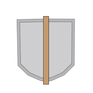
This is the back part of my shield/Heraldry.  
I used the pen tool to make one half of the shape, 
then copied and flipped it. 
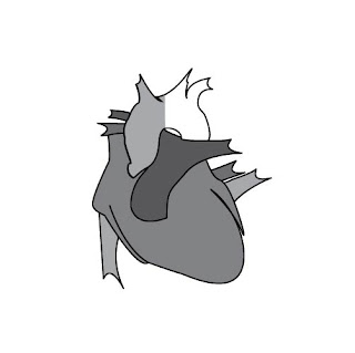
This is the heart after I traced it.


Then I added the cross into the design.  
I had to cut the top part of the heart 
(as you can see in the picture before this) 
so the top part would overlap and 
look like it was going through the heart.
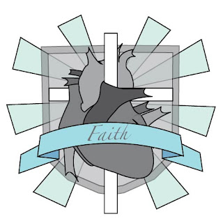
I added the banner going across the front, 
which I made using the pen tool.  
I also added the rays in the background and 
changed the opacity on the shield to make them more visible.  


5.18.2009

photos used in self-portrait

hand drawn self-portrait (2009)


self-portrait from first grade


self-portrait


This is my self-portrait in the style of David Hockney. I incorporated a self-portrait I did when I was in first grade along with some recent pictures of myself. I'm getting better at using the tools in Photoshop, and I had a fun time doing this project!

4.27.2009

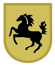
final porsche logo


The logo turned out pretty well. The typography could be adjusted some. I should have done the stripes differently (they should be behind the "background" edge). There's a couple more mistakes, but other then that it's looking good.

porsche logo process (backwards)


I had to match up the colors.....which turned out to be way easier than I thought, after someone showed me how.


I used the pen tool to trace the horse.  By this time in the process I was getting pretty good at using the pen tool so it went pretty quick.  (side note: the horse is the coolest part)


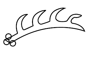
This the method I used for making the "branch/sword-looking" images.
I traced the typography with the pen tool.  Some parts of the letters are thicker than other parts, so I could have spent more time on it, but it was already taking forever.


I started out with the entire shape of the logo then gradually added some of the larger geometric shapes on top.  Since this part is symmetrical, I only had to make one side then copy it and flip it.  I learned how to use the "connector" tool

4.15.2009


first attempt

second attempt

final post card (back)

final post card (front)

4.13.2009

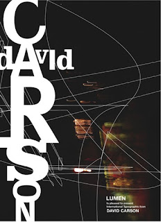
David Carson: Graphic Designer


David Carson was one of the most influential graphic designers in the 1990s. Carson was born in 1952 and was raised in NYC. Traveling a lot as a child helped to spur his imagination and creativity. After going to art school, he worked as a high school teacher in San Diego, California from 82-87. The bohemian culture of Southern California became the inspiration for is newly discovered graphic design skills. By the late 80's his "dirty" signature style was fully developed. He soon became the art director for Transworld Skateboarding Magazine. Along with being a professional surfer he worked for Surfer Magazine in he early 90's. His most famous magazine was RayGun, focusing on international music and lifestyle. He was the original design consultant for Blue magazine in 1997. Carson went on to work for many big companies including: Pepsi, Nike, Microsoft, Budweiser, and MTV. His original grunge style didn't follow the "traditional" graphic design standards. David Carson's messy style of twisting typography and photographs into designs make his designs original, appealing to the eye, and stand out among the crowd.

4.06.2009