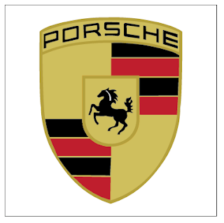

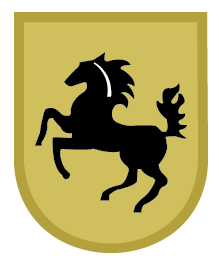
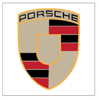
I had to match up the colors.....which turned out to be way easier than I thought, after someone showed me how.
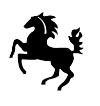

I used the pen tool to trace the horse. By this time in the process I was getting pretty good at using the pen tool so it went pretty quick. (side note: the horse is the coolest part)
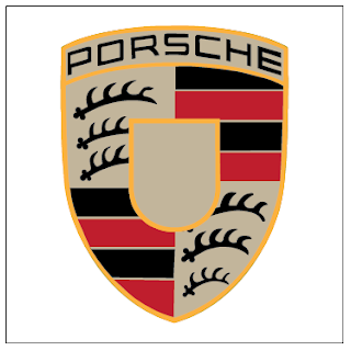

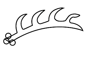 This the method I used for making the "branch/sword-looking" images.


 This the method I used for making the "branch/sword-looking" images.
I traced the typography with the pen tool. Some parts of the letters are thicker than other parts, so I could have spent more time on it, but it was already taking forever.
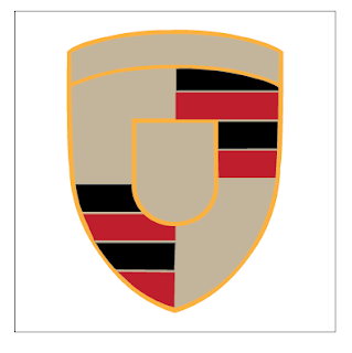


I started out with the entire shape of the logo then gradually added some of the larger geometric shapes on top. Since this part is symmetrical, I only had to make one side then copy it and flip it. I learned how to use the "connector" tool
